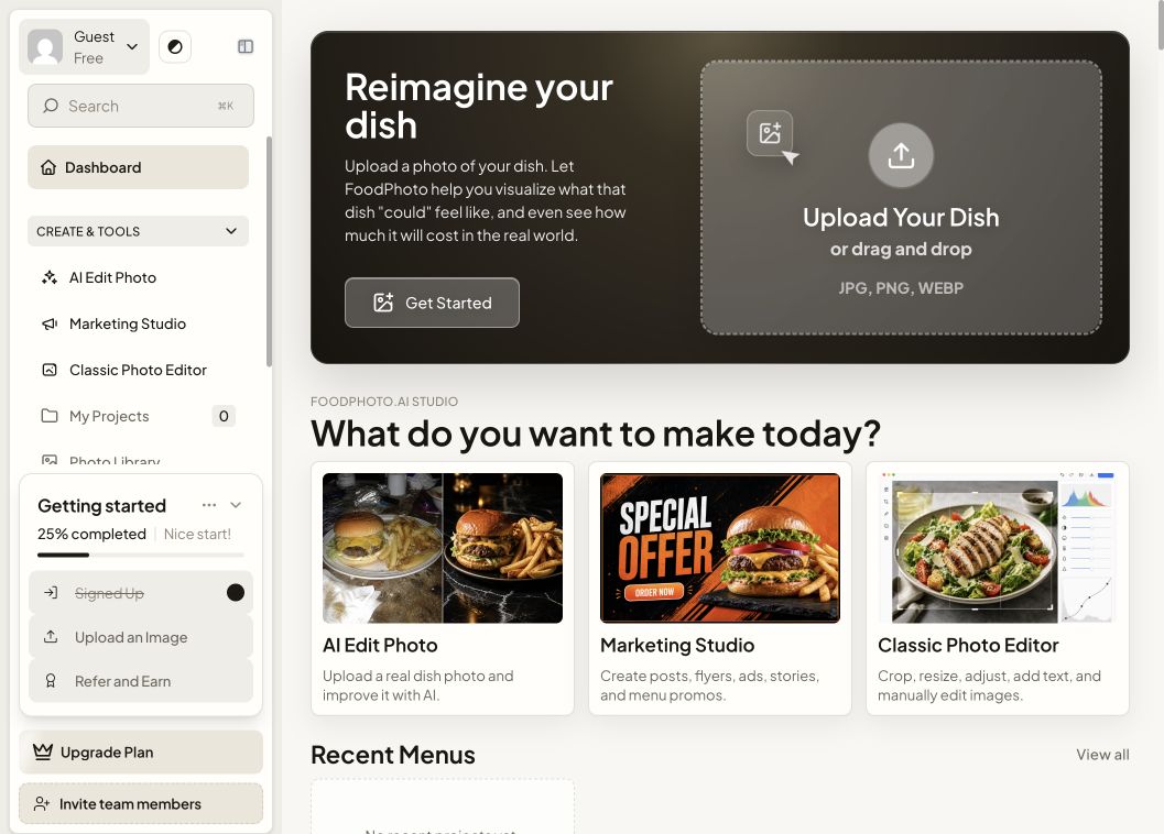
AI · foodphoto.ai
FoodPhoto AI
AI imaging product for hospitality teams that need polished, appetizing visuals and a simpler content workflow.
Case studies · visual archive
Products, platforms, and experiments shown through their real interfaces. Keep scrolling—the archive loads as you move.
52 projects · video previews
AI · foodphoto.ai
AI imaging product for hospitality teams that need polished, appetizing visuals and a simpler content workflow.
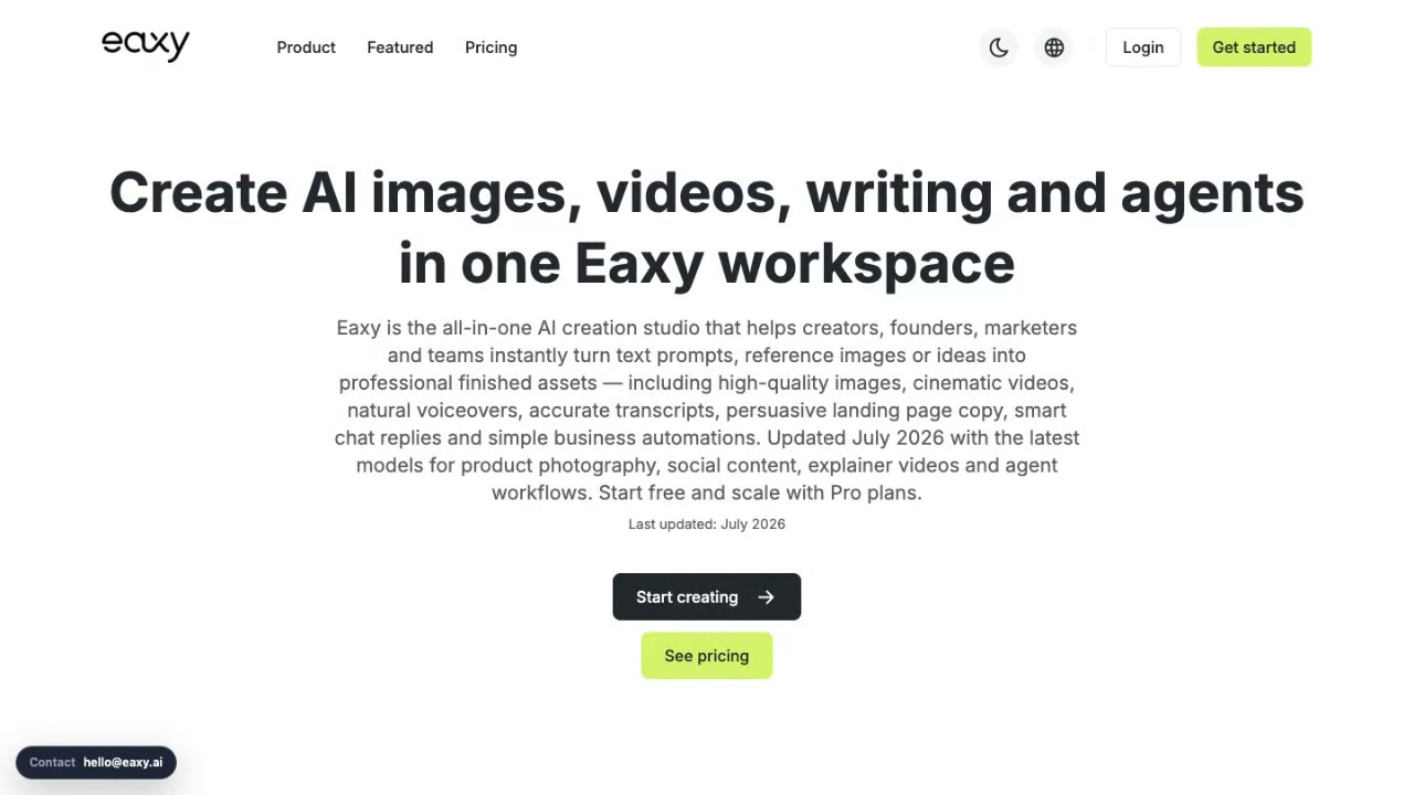
AI · eaxy.ai
AI website builder designed to move from business context to a launch-ready site with less friction and stronger presentation.
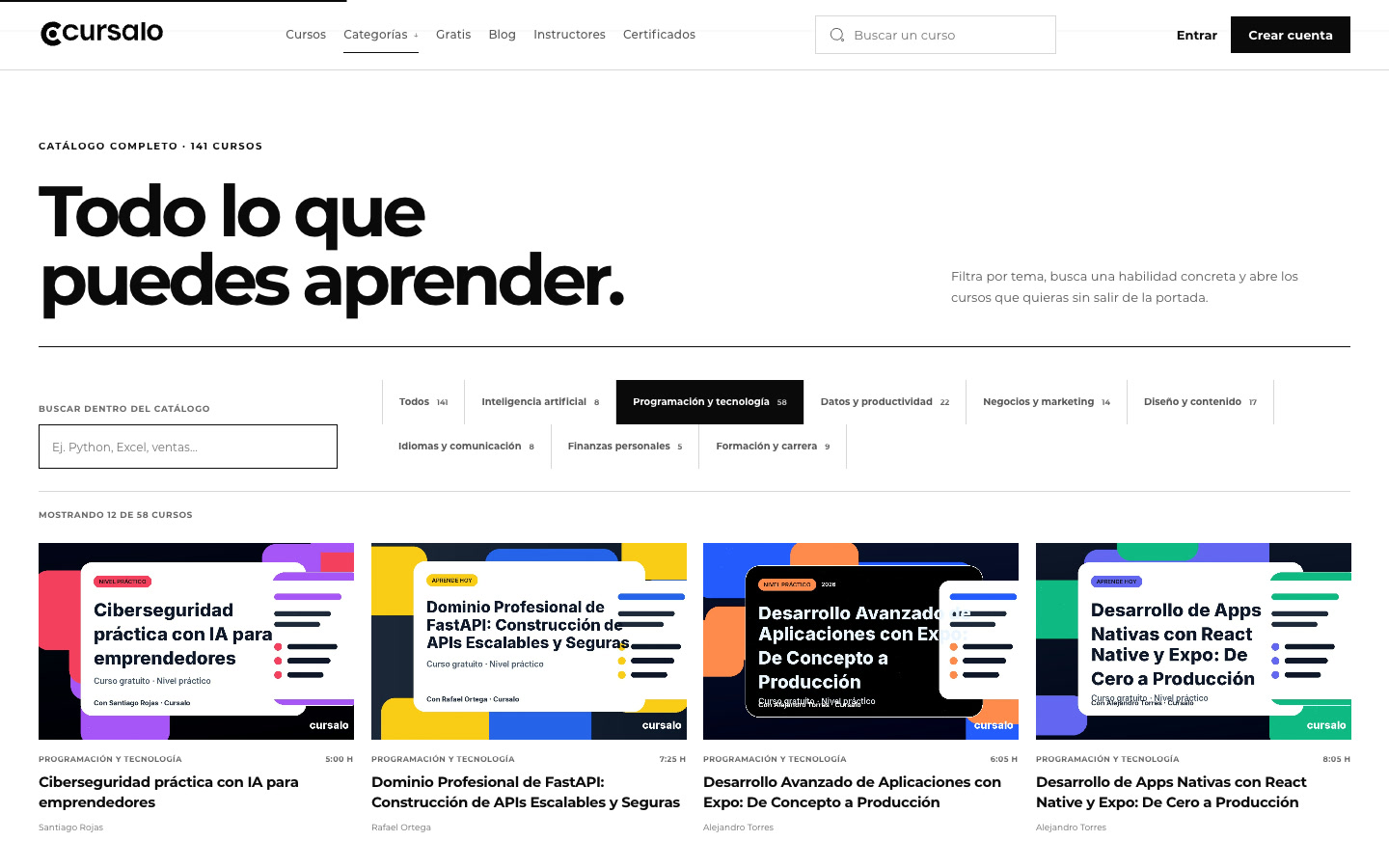
Education · cursalo.com
Course platform combining marketplace structure, mobile app screenshots, payment infrastructure, content operations, and a foundation for sustained catalog growth.
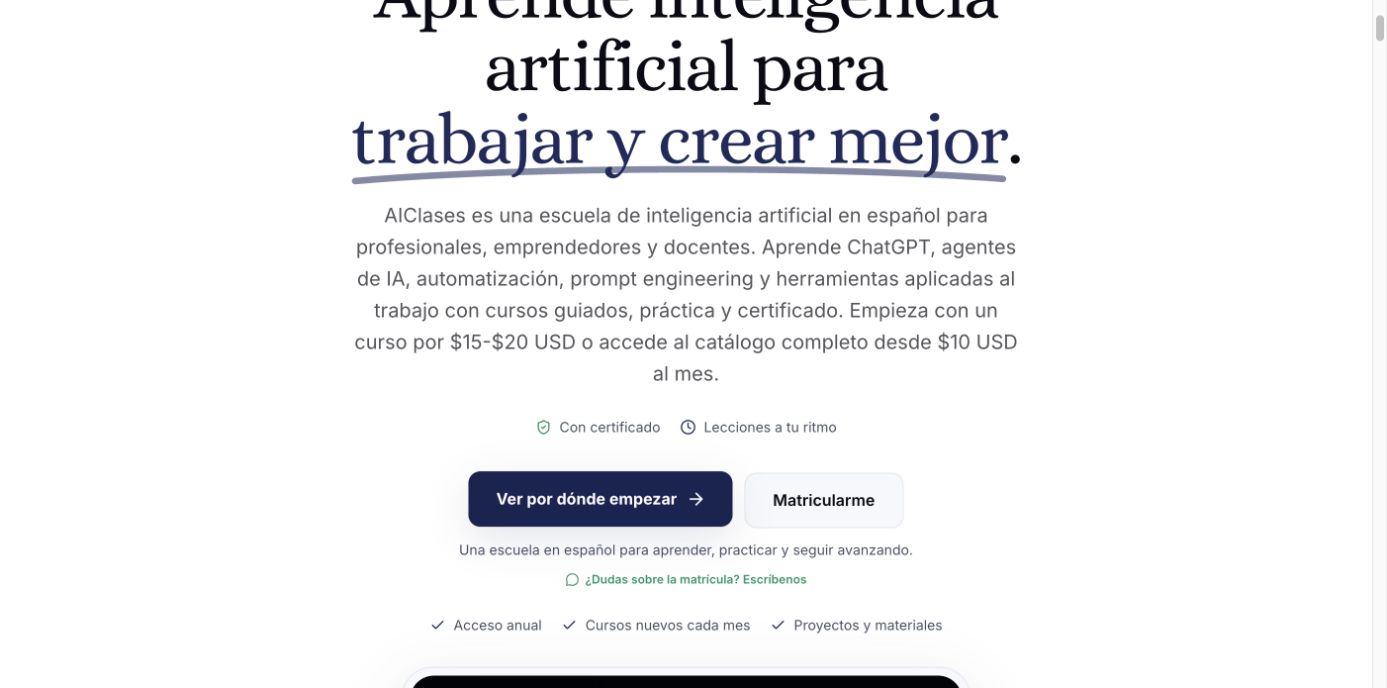
Education · aiclases.com
Spanish-language AI learning platform built around clear pathways, search-driven discovery, and conversion-aware course presentation.
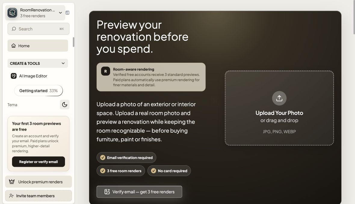
AI · roomrenovation.ai
Interior redesign product with generated room outputs, mobile app shell, purchase surfaces, and renovation-focused product assets.
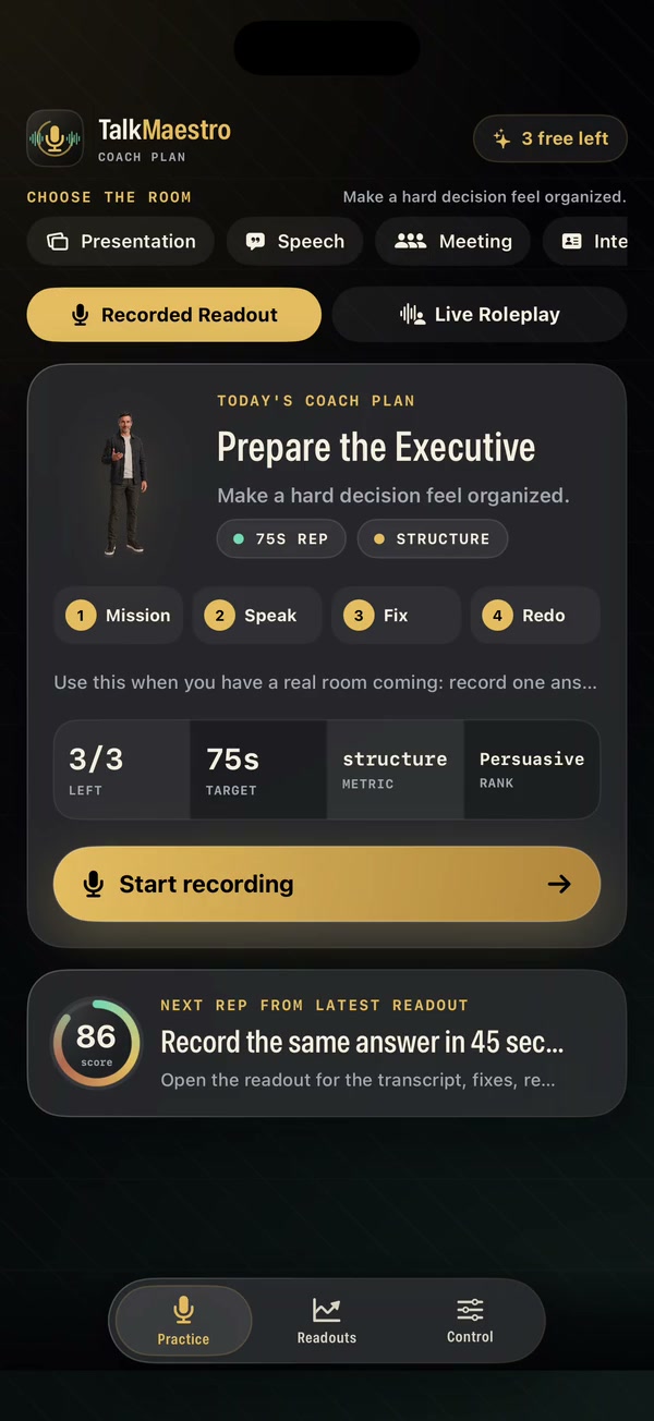
Education · talkmaestro.com
AI language learning product built around speaking practice, feedback loops, and more natural communication training.
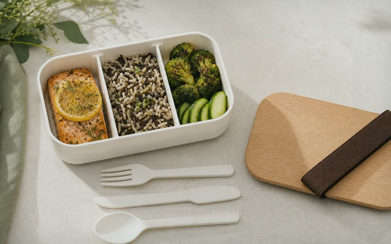
Consumer · eateasier.com
Consumer planning product built around usability, nutrition workflows, and calmer everyday decision-making.
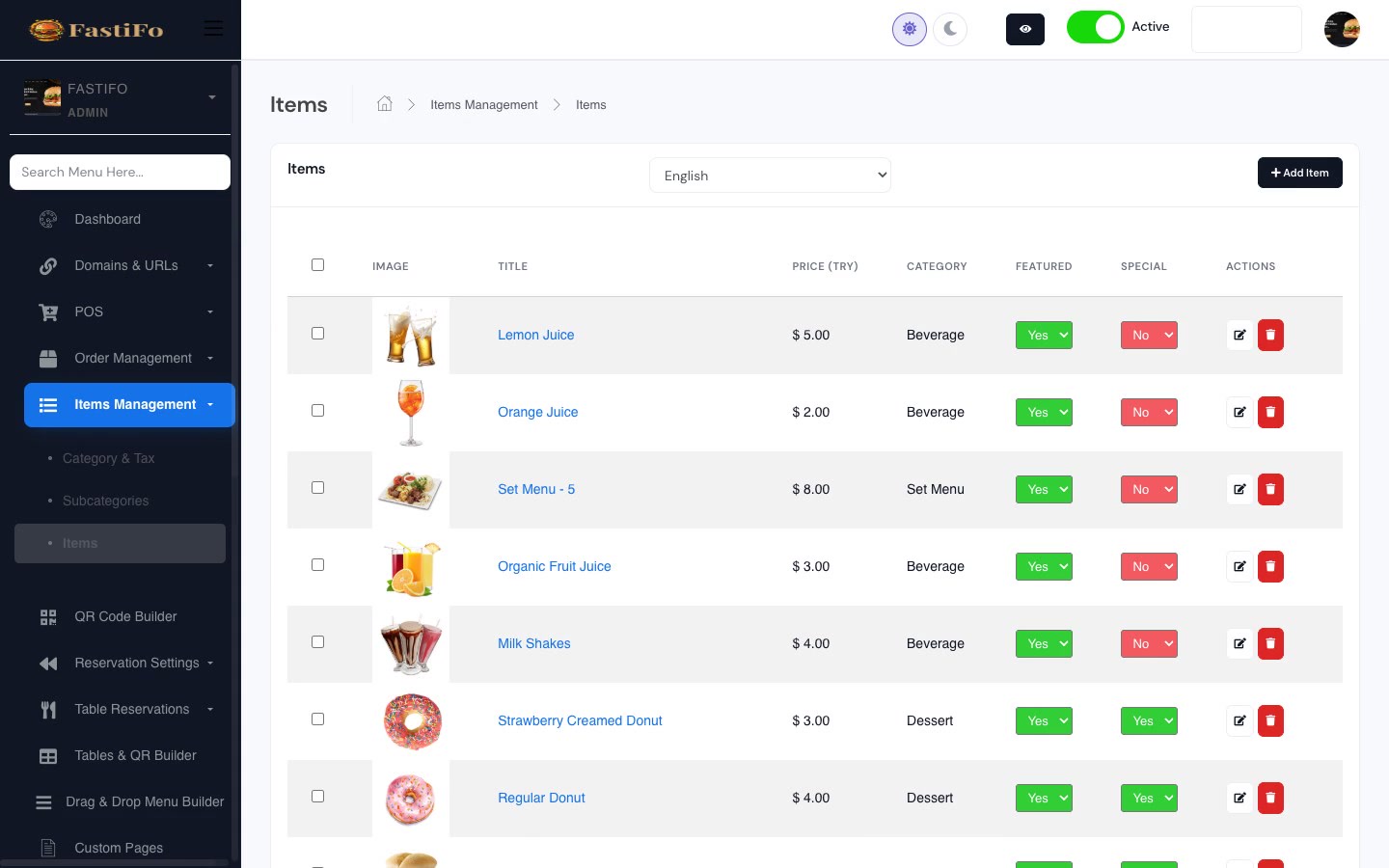
Restaurant Tech · wobistro.com
Restaurant operating system combining direct ordering, QR menus, and service tooling in a single workflow layer.