Mission
Give the brand a clearer point of view, stronger visuals, and a more intentional read. Present technical execution and digital opportunity through a sharper Argentina-focused lens.
Brand · Portfolio system 2026
Give the brand a clearer point of view, stronger visuals, and a more intentional read. Present technical execution and digital opportunity through a sharper Argentina-focused lens.
Develop Argentina appears here as a live signal of the studio's range across brand, interface work, and launch-ready execution.
Active visual
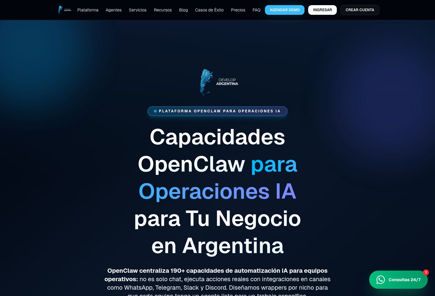
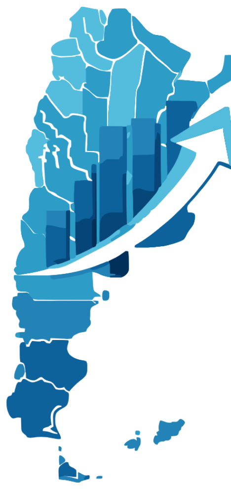
Live product capture
01 / 02
product
Live product capture
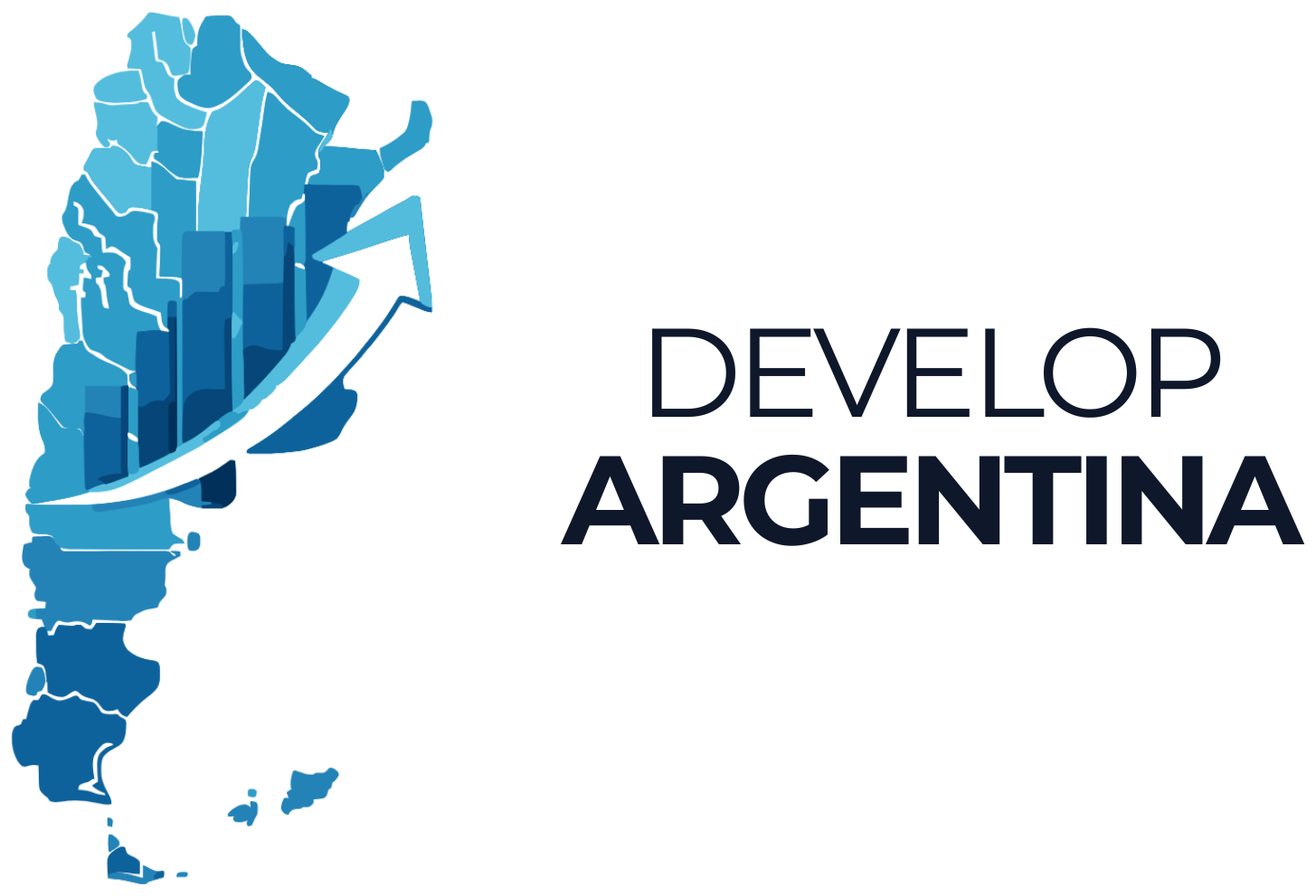
cover
Portfolio cover
Mission
Give the brand a clearer point of view, stronger visuals, and a more intentional read. Present technical execution and digital opportunity through a sharper Argentina-focused lens.
Vision
Make the website feel like a credible surface with its own identity, not just a placeholder. Brand and positioning surface connecting local development capability, digital execution, and a more credible regional narrative.
System signals
Project anatomy
Story
Develop Argentina enters the archive as live proof: not a hypothetical concept, but a surface that already needed product, design, and launch decisions to become real.
Typographic direction
Narrative-led typography with stronger rhythm, more breathing room, and a layout meant to give the brand a clearer point of view.
Visual language
The visuals are treated as a narrative surface: cover imagery, marks, screenshots, and supporting assets give the brand more presence and memory.
Domain memory
developargentina.com was registered on March 4, 2025 and marks the moment this project moved from internal concept to public surface.
Story
Develop Argentina appears here as a live signal of the studio's range across brand, interface work, and launch-ready execution.
Brand and positioning surface connecting local development capability, digital execution, and a more credible regional narrative.
Stack + delivery
Positioning and product framing
Visual direction and interface hierarchy
Frontend implementation and launch surface
Asset library
These pages no longer treat tiny favicons, duplicate icons, or throwaway exports as hero material. They stay with the visuals that actually clarify the product and the brand.
5 brand assets · 1 interface assets · 1 editorial pieces
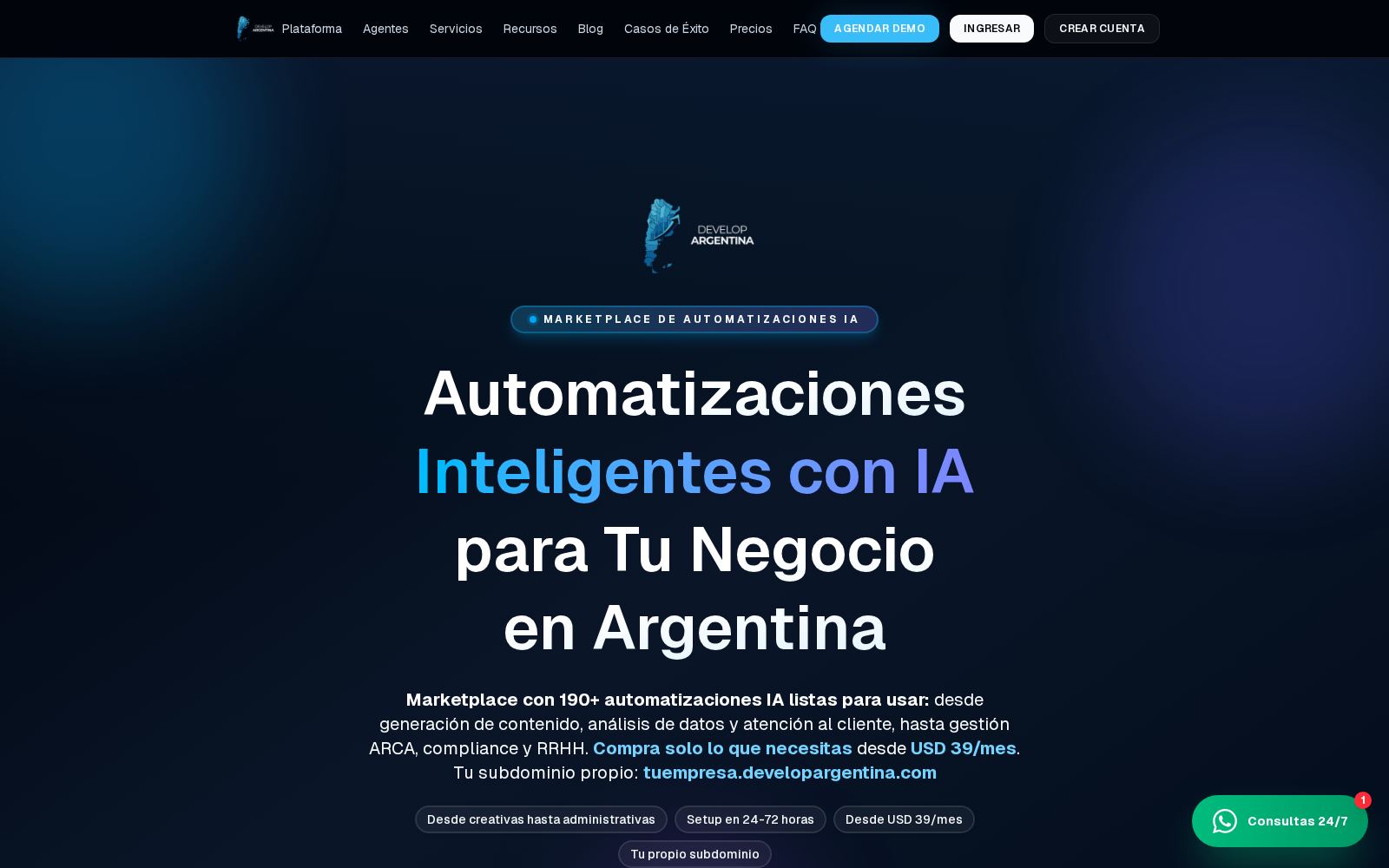
Live product capture
Portfolio cover
Brand kit

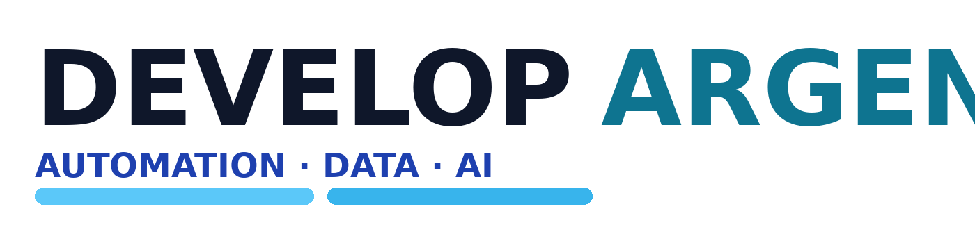
brand
Logo Wordmark Dark
Original source: apps/web/public/brand/logo-wordmark-dark.png
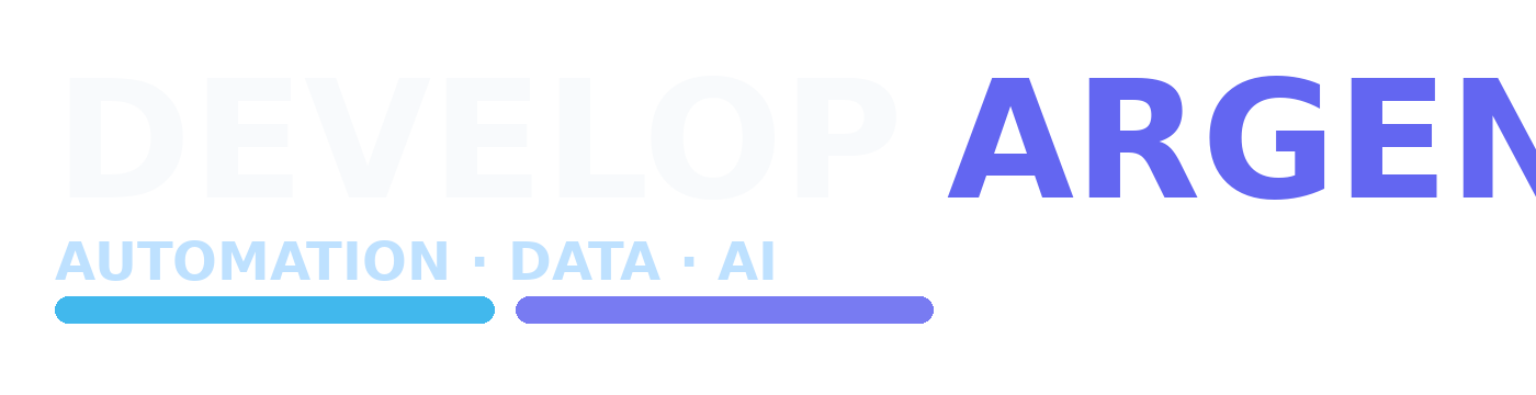
brand
Logo Wordmark Light
Original source: apps/web/public/brand/logo-wordmark-light.png
brand
Logo Dark
Original source: apps/web/public/logo-dark.png
brand
Logo Map Mark
Original source: apps/web/public/brand/logo-map-mark.png
brand
Logo Lockup Dark
Original source: apps/web/public/brand/logo-lockup-dark.png
Process
Step 1
The first step is deciding what the site must communicate and what emotional tone it has to carry.
Step 2
Layout, texture, and image treatment are shaped to feel more intentional and less interchangeable.
Step 3
The resulting site becomes a clearer place for brand credibility, discovery, and next-step conversion.
Related work
Studio
The portfolio and studio layer connecting products, experiments, technical range, and a more authored point of view.
Brand
Agency brand with stronger service framing, clearer conversion surfaces, and more confident regional positioning.
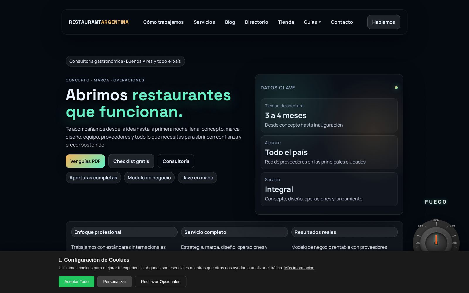
Restaurant Tech
Consulting-led hospitality product focused on opening, operating, and improving restaurant businesses in Argentina.
Next step